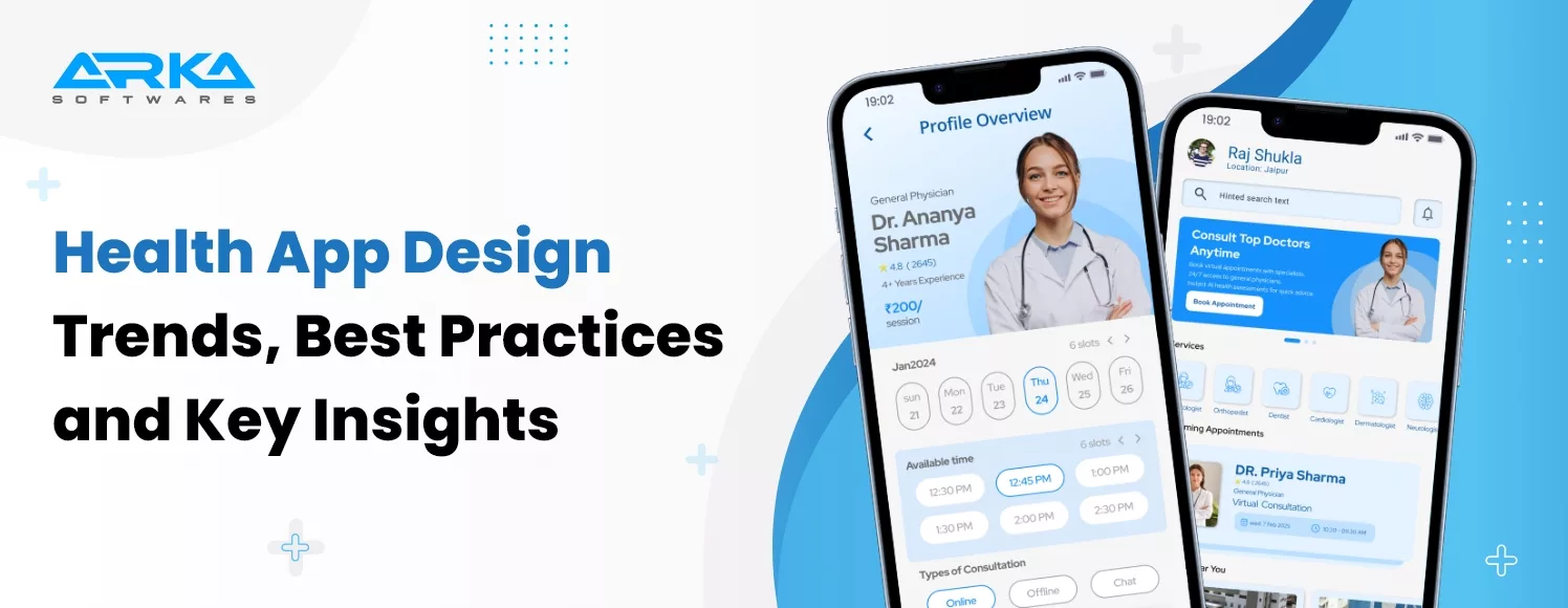
With digital health technology becoming more advanced and widely adopted, the importance of a thoughtful and intuitive healthcare app design cannot be overstated.
Healthcare apps in 2025 aren’t just tools—they’re digital lifelines. Whether it’s an AI-powered health assistant keeping track of vitals, a telemedicine app connecting patients with doctors in seconds, or a seamless medical UI design that makes navigating care effortless, the future of healthcare is unfolding in the palm of our hands.
But here’s the catch, even the most groundbreaking technology falls flat if the user’s experience isn’t right. A cluttered interface, confusing navigation, or slow response time can mean the difference between timely care and missed opportunities.
In a world where healthcare is more digital than ever. Furthermore, there is the revenue in the ‘Health & Fitness’ segment of the app market in the United States was forecast to continuously increase between 2024 and 2027 by in total 591.5 million U.S. dollars (+34.18 percent).
This blog explores the healthcare app design landscape, including top trends, best practices, essential features, and how to overcome key challenges in 2025.
Investing in high-quality healthcare app design is not just a cosmetic decision—it directly impacts user engagement, patient satisfaction, and business success. A well-structured and visually compelling health app UI design drives functionality, trust, and retention, making it a strategic advantage for any digital health solution.
The health care app consists of visually appealing and well-structured app immediately attracts users. A seamless interface combined with smooth navigation keeps them engaged, reducing bounce rates and encouraging longer interactions, ultimately leading to better user satisfaction and app success..
A striking and aesthetically pleasing user interface creates a strong first impression, increasing the likelihood of downloads. Users are more likely to engage with an app that looks modern, professional, and easy to use.
A proper health care app design adapts effortlessly to different devices and screen sizes, providing a smooth experience. It eliminates usability issues, reduces frustration, and ensures users can navigate efficiently, regardless of their device.
A well-thought-out UI/UX design guides users toward desired actions, improving conversion rates. An intuitive experience fosters trust, making users more likely to return, increasing retention, and driving long-term engagement.
A simple, intuitive interface makes navigation effortless, reducing the learning curve. Accessibility features, such as readable fonts and voice commands, ensure inclusivity, making the app usable for a diverse audience, including those with disabilities.
A well-planned health care app design minimizes unnecessary development iterations, reducing time and costs. It also optimizes performance, ensuring smooth operations and faster responses, improving overall efficiency for both users and businesses.
A polished, professional design signal’s reliability and quality. Users associate a sleek, user-friendly interface with a trustworthy brand, making them more likely to engage, recommend, and stay loyal to the app.
Insight: According to industry insights often cited in Forrester and UX research reports,
up to 70% of users abandon apps due to poor user experience,
making UI/UX design a mission-critical focus for healthcare applications.
In today’s digital-first world, investing in a well-designed healthcare app is not just a competitive advantage—it’s a strategic necessity. Whether you’re a hospital, clinic, or digital health startup, the right healthcare app design can transform patient care, boost operational efficiency, and increase ROI.
A medical app design ensures seamless navigation, easy appointment booking, and real-time health tracking. User-friendly interfaces improve patient engagement, leading to better health outcomes and increased trust in the healthcare provider.
Patients can access medical services from anywhere, reducing the need for physical visits. Telemedicine, e-prescriptions, and remote monitoring enable timely interventions, making healthcare more inclusive, especially for individuals in remote or underserved areas.
Digital healthcare apps streamline administrative tasks, automate patient records, and minimize paperwork. This reduces the burden on medical staff, enhances workflow efficiency, and allows healthcare providers to focus more on patient care rather than administrative processes.
Investing in healthcare app design attracts more users, increases patient retention, and opens new revenue streams through premium services. A well-optimized app strengthens a healthcare business’s competitive edge in an increasingly digital-driven medical landscape.
Proper medical app design incorporates encryption, secure authentication, and compliance with regulations like HIPAA. This ensures patient data protection, reduces the risk of cyber threats, and fosters trust among users, enhancing the credibility of healthcare providers.
Given below are some vital aspects of healthcare app design explained in short:
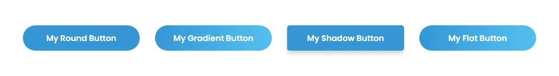
Input controls like buttons, text fields, and dropdowns are vital for gathering patient information quickly and accurately. These elements need to be intuitive, responsive, and easy to use for all patient demographics.
Buttons drive key actions like scheduling, submitting forms, or contacting support. They should be large enough for easy tapping, clearly labeled with action verbs (e.g., “Book Appointment”), and styled to reflect the app’s color scheme.
Text fields are used to capture patient input, like names, dates, or symptoms. Design them with ample space, floating labels, and real-time validation to prevent errors and improve data accuracy.
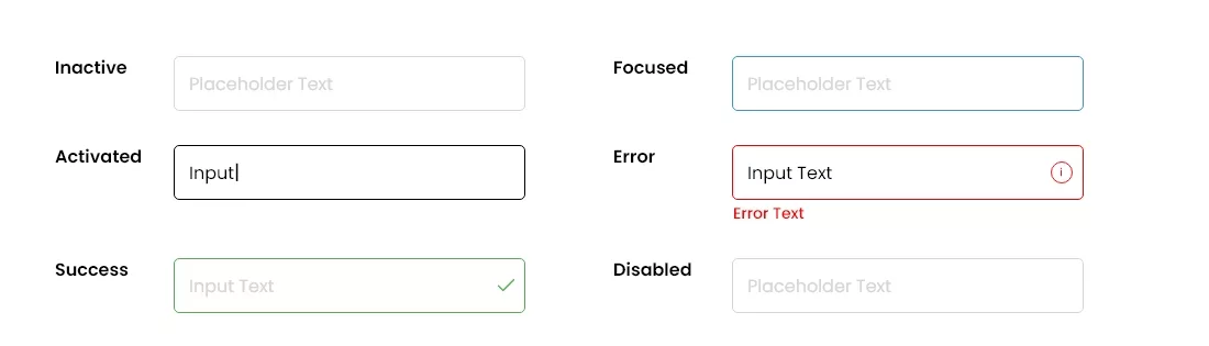
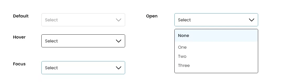
Dropdowns simplify multiple-choice inputs such as selecting a department, location, or insurance provider. Use concise labels and group similar options to avoid overwhelming the user.
These are ideal for selecting a single option among many, such as gender or type of consultation. Ensure each option is clearly labeled and well-spaced to avoid accidental selection.
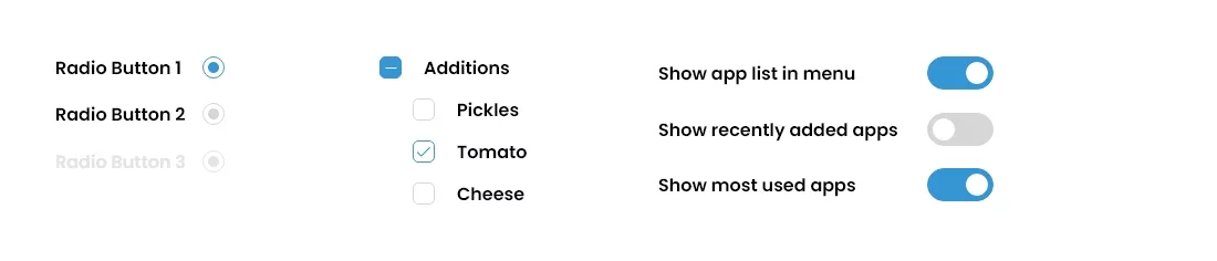
Checkboxes allow multiple selections—for example, checking multiple symptoms or accepting terms and conditions. Use them for non-exclusive inputs and pair each with a clear label.
Toggles are switches for enabling/disabling settings, such as turning on appointment reminders or switching to dark mode. Ensure they show real-time state changes to confirm user action.
Well-designed navigation components ensure users can move through the app effortlessly. Clear, consistent navigation reduces frustration and improves overall user experience.
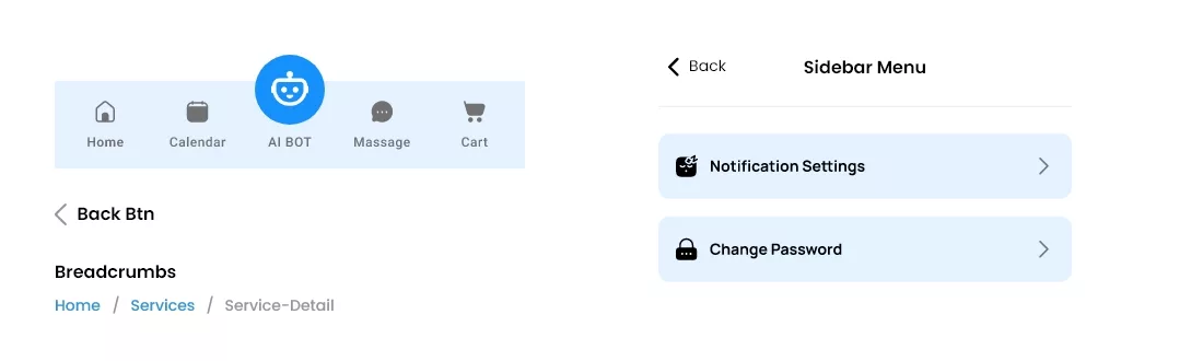
Typically fixed at the top or bottom, it helps users switch between main sections like “Home,” “Appointments,” and “Profile.” Icons paired with text labels improve clarity and speed of use.
Used to switch between related views such as “Upcoming,” “Completed,” and “Cancelled” appointments. Tabs should be clearly labeled and indicate which is active through color or underline.
A collapsible panel that holds less-frequent features like Help Center, Settings, or Health Records. It keeps the interface clean while giving access to extended functionality.
Useful in complex workflows like patient onboarding or form filling. They show a user’s current step in the process, allowing them to navigate back without losing progress.
Always present and easy to find, especially in Android apps. It enables users to return to the previous screen, essential for reducing anxiety in critical healthcare interactions.
Informational components display critical system messages and patient data in an easy-to-understand format. Effective communication keeps users informed without overwhelming them.
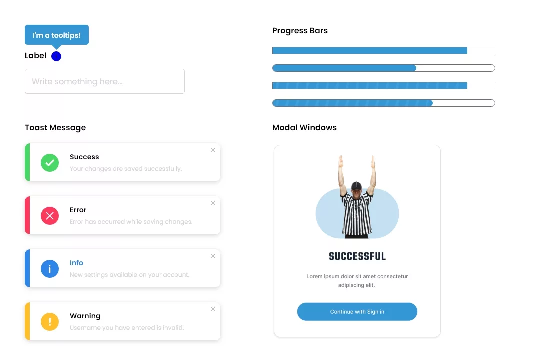
Helpful mini popups that explain unfamiliar terms (e.g., “EHR,” “BMI”). These enhance understanding without crowding the interface and are especially helpful for first-time users or elderly patients.
Show the user how far along they are in a process, such as completing a health profile or booking flow. Visual feedback reduces anxiety and encourages completion.
Temporary, non-intrusive messages that appear at the bottom of the screen (e.g., “Appointment Confirmed”). They inform users without requiring any action, maintaining the flow of experience.
Used for confirmations, warnings, or critical information. For example, a modal might ask: “Are you sure you want to cancel this appointment?” They demand user action before proceeding.
Small visual indicators often used on icons (e.g., a red circle on the message icon indicating unread messages). They attract attention to important updates without being disruptive.
Container components group related information in a way that enhances user comprehension and navigation.
Visually organized content blocks used for displaying doctor profiles, lab results, or blog articles. Each card typically includes a title, image, and CTA button, making info easily scannable.
Expandable sections useful for FAQs, medical history, or additional instructions. They prevent information overload by revealing details only when the user is interested.
Used for displaying content like test reports, drug categories, or appointment time slots. Grid layouts offer a balanced and organized view, especially for visual-heavy or option-rich content.
Vertical or scrollable item groups such as medication lists, previous appointments, or allergy history. Lists should include icons or thumbnails to help users quickly recognize and navigate entries.
A consistent design language across your healthcare app builds trust and ensures users can interact with the app intuitively, every time.
Colors influence user emotion. Healthcare apps often use calming hues like blue or green. Maintain contrast for readability and apply accent colors to highlight CTAs or alerts.
Use legible, web-safe fonts such as Roboto, Open Sans, or Helvetica. Apply consistent heading sizes, body text, and font weights to establish visual hierarchy and enhance readability.
Icons should be clear, universal, and minimal. For instance, use a stethoscope icon for “Doctors,” a bell for notifications, and a calendar for appointments. Avoid overly decorative or ambiguous icons.
Ample white space and consistent alignment improve content flow. A well-structured layout reduces visual clutter and helps guide users to the most important elements on the screen.
Text in the app should sound reassuring, clear, and professional. Instead of “Error 404,” say “We couldn’t find what you’re looking for. Try again or contact support.”
To develop healthcare mobile apps given below are the detailed steps about it:
Understand user demographics, pain points, and expectations. Conduct surveys, interviews, and market research to gather insights that shape the app’s functionality and design, ensuring it meets both patient and healthcare provider needs.
Study existing healthcare apps to identify strengths, weaknesses, and market gaps. Evaluate UI/UX patterns, features, and user feedback to develop a unique value proposition that enhances patient engagement and usability.
Develop a one-page business model outlining the problem, solution, key metrics, revenue streams, and competitive advantages. This helps align stakeholders on goals and ensures a structured approach to app development.
Define scenarios and interactions from the user’s perspective. Map out step-by-step navigation to create an intuitive experience, ensuring accessibility and seamless engagement for both patients and healthcare professionals.
In health app design you can create basic, grayscale sketches to visualize app layout and structure. Focus on placement of key features, user navigation, and screen hierarchy before refining the visual aspects.
Enhance wireframes with detailed UI components, colors, typography, and branding. Ensure an aesthetically appealing, accessible, and responsive design that aligns with healthcare industry standards.
Convert mockups into a clickable prototype using design tools. Simulate user interactions to test the flow, responsiveness, and overall usability before moving into development.
Gather user feedback through testing sessions to identify pain points and necessary improvements. Iterate based on insights to refine the prototype and enhance user satisfaction.
Prepare a comprehensive design package, including UI components, style guides, and interaction guidelines. Ensure a smooth transition for dedicated developers by maintaining clear documentation and asset organization.

Given below are 10 best health app design examples in healthcare app development process:
A 3D anatomy platform designed specifically for iPads to address smartphone screen limitations.
The Useful Features:
Connects blind users with volunteers for real-time visual assistance.
The Useful Features:
A mobile-optimized web app for healthcare providers.
The Useful Features:
A SaaS tool for automated contact tracing.
The Useful Features:
An IoT app that connects with an inhaler to track inhalation data and air quality.
The Useful Features:
A therapeutic app for panic management integrating physical and mental health data.
The Useful Features:
Promotes healthy habits for corporate employees to reduce medical costs.
The Useful Features:
A menopause wellness app fostering activity and social engagement.
The Useful Features:
An IoT app supporting remote urinary tract infection testing.
The Useful Features:
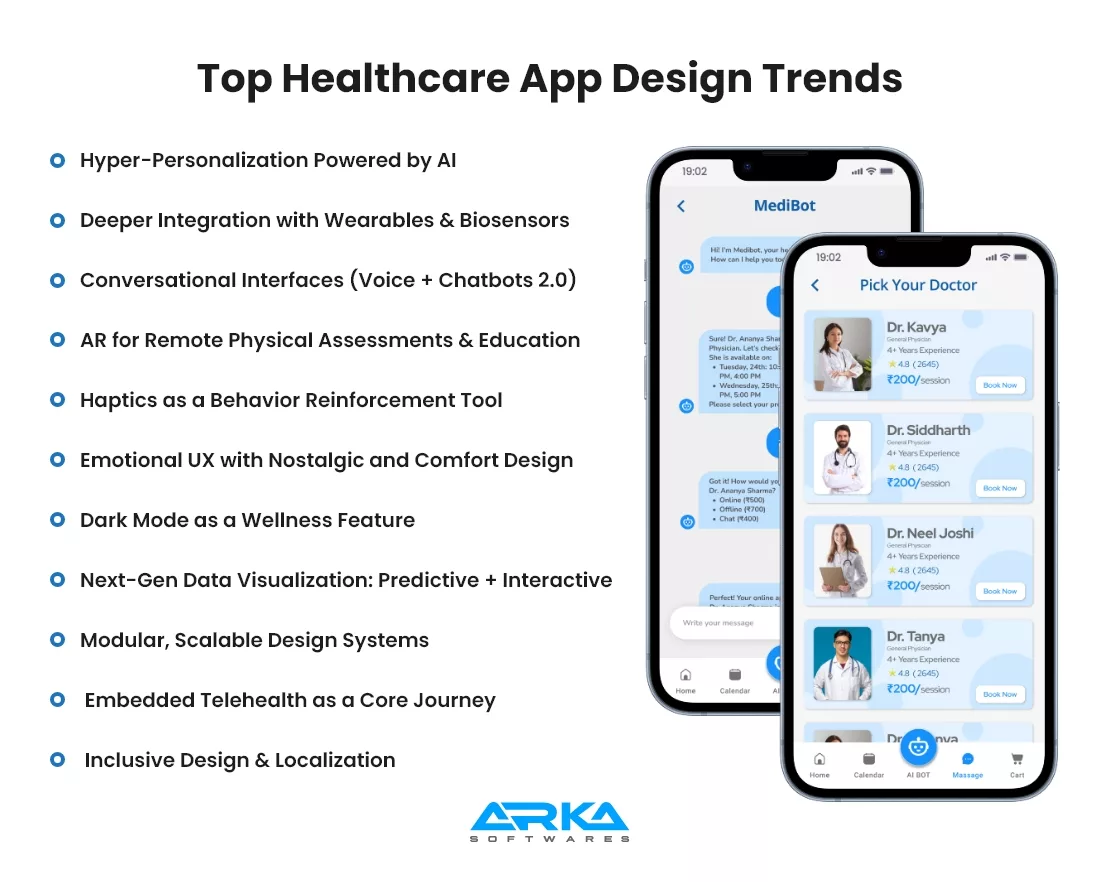
Is your app aligned with this year’s user experience standards? With patient needs becoming more nuanced and technology more advanced, here are the top design trends transforming healthcare apps in 2025:
In 2025, AI has moved beyond just reminders. It’s now about anticipating user needs through real-time health analytics, predictive care suggestions, and dynamic goal setting.
Smart UX: Show users personalized health journeys, adaptive interfaces, and even mood-based content using behavior + biometric data.
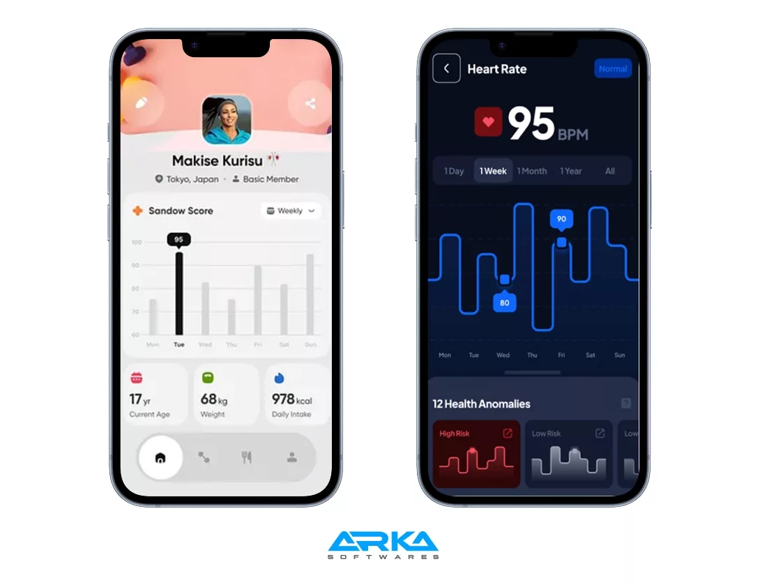
Apps now sync not only with smartwatches but also with glucose monitors, ECG patches, and sleep-tracking rings. Real-time feedback from these devices is now a core UX element.
Design Consideration: Real-time vitals must be visualized clearly and instantly, with actionable insights (e.g., a calming animation after a heart rate spike).
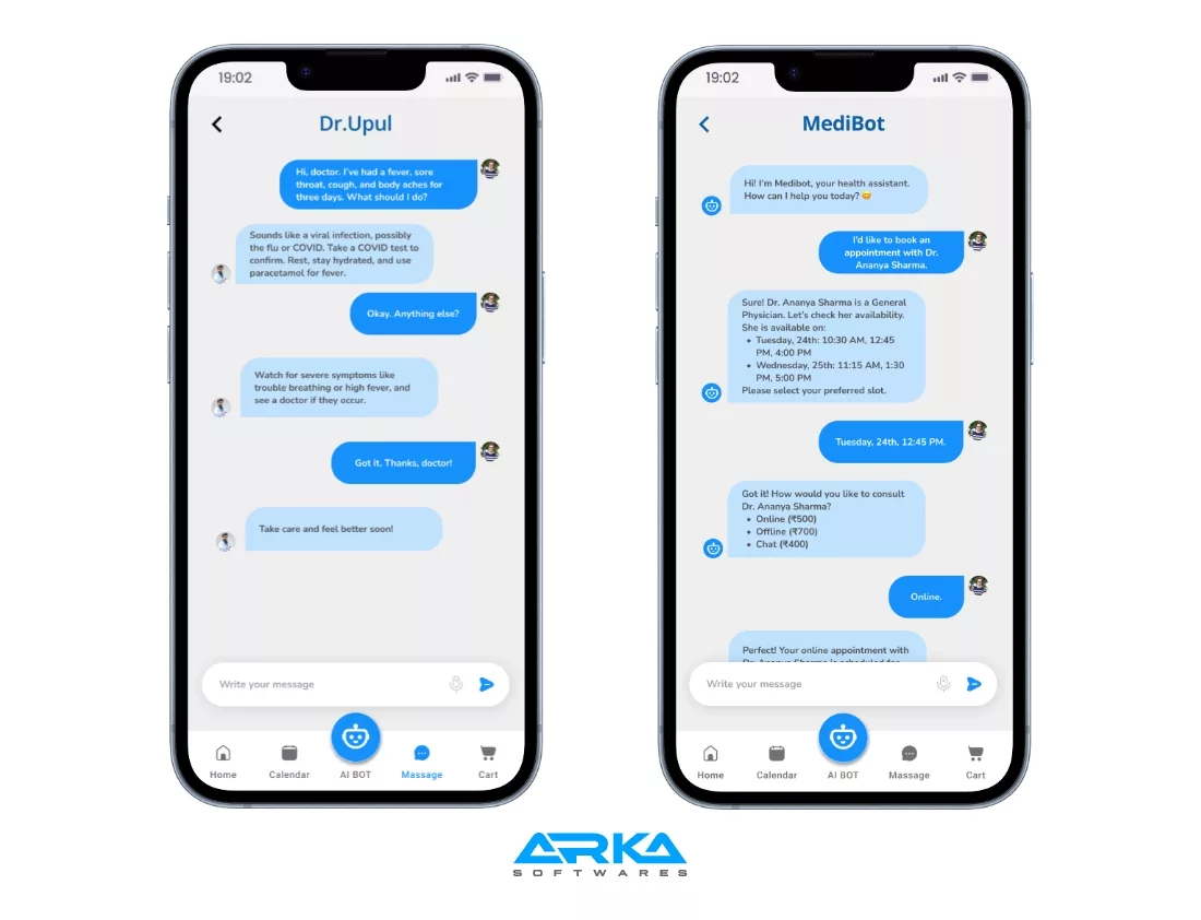
Voice is smarter and more reliable in 2025. Combined with AI-driven chatbots, users now expect natural conversations that understand intent, not just commands.
️ Best Practices: Use conversational UI for triage, medication guidance, or mental health check-ins, especially for aging users or those with accessibility needs.
AR is maturing into a standard feature, especially for physiotherapy, chronic pain tracking, or patient education. Users can now scan their body posture or movement in 3D and receive instant feedback.
UX Focus: Minimalist overlay design, with guidance animations and accurate body-tracking visuals.
Micro-vibrations have evolved from simple notifications to behavioral nudges. They now play a key role in treatment adherence and mindfulness.
UX Tip: Subtle haptic pulses can signal medication time, breathing patterns, or achievement of a fitness milestone.
Emotional design continues to be trending. In 2025, apps are leaning more into mental wellness through familiarity. Retro visuals, warm tones, and tactile animations help create a sense of safety and trust.
Design Vibe: Rounded corners, soft gradients, hand-drawn icons—UX that feels like a hug.
This is no longer about just looking cool—it’s about circadian health. Apps now switch to dark mode intelligently based on time, user habits, and even ambient light.
Pro Tip: Use adaptive theming to minimize screen brightness in sensitive health contexts (e.g., mental health apps at night).
2025 apps need to go beyond displaying charts—they need to tell a story. Predictive analytics, animated graphs, and body heatmaps help users understand their long-term wellness patterns.
New Visuals: Swipeable trend stories, interactive symptom maps, and “health forecast” dashboards.
With apps expanding across platforms—phones, tablets, kiosks, wearables—your design system must scale. A modular, token-based system ensures visual and UX consistency across every experience.
Use Case: Walker Tracker’s cross-platform wellness app thrives thanks to its atomic design system.
Telehealth is now built-in, not bolted on. Its medical app Ui design is perfectly good. From onboarding to aftercare, video consultations, symptom checkers, and EHR integration form a seamless, guided user journey.
UX Flow: Automatic check-in flows, virtual waiting rooms, and post-consult summaries make the experience feel just like an in-clinic visit.
Inclusivity goes beyond accessibility. 2025 apps are culturally aware, language-flexible, and designed for all age groups, abilities, and tech comfort levels.
Smart Feature: Dynamic font scaling, multiple input modes (voice, tap, gesture), and location-sensitive content.
Designing for healthcare is more than aesthetics—it’s about creating interfaces that can improve, or even save, lives. Below are the key UX design challenges faced in healthcare today:
Designers must create intuitive apps while meeting strict standards like HIPAA, GDPR, or HL7. While users expect simplicity, regulatory needs add unavoidable complexity.
From tech-savvy patients to elderly users and busy doctors, healthcare apps serve multiple personas. Designing for various levels of tech literacy and accessibility is a major hurdle.
Healthcare apps often juggle massive datasets—test results, EHRs, sensor inputs. Designers must simplify complex information through smart data visualization without overwhelming the user.
The health app Ui design in healthcare should convey empathy. Emotional UX—calm visuals, encouraging microcopy, and supportive tone—helps ease anxiety during medical experiences.
Accessibility is non-negotiable. Healthcare apps must support screen readers, voice control, scalable fonts, high-contrast UI, and motion sensitivity preferences.
From medication adherence to appointment follow-ups, engagement is critical. UX should include smart reminders, gamified progress, and behavior nudges without being intrusive.
Many healthcare institutions still use outdated tech. Designers often have to work with APIs and systems that limit design flexibility, while ensuring the front-end still feels modern.
With highly sensitive data at stake, trust is everything. Transparent design practices—like clearly presented consent forms and data encryption cues—are essential to reassure users.
Apps need to process real-time data from wearables or devices without causing alert fatigue. Alerts must be actionable, timely, and clear to prioritize urgency appropriately.
Healthcare journeys often span mobile apps, desktops, kiosks, and wearables. Consistent, responsive design across platforms ensures continuity of care and convenience.
The cost to design a healthcare app typically ranges from $5,000 to $15,000 or more, depending on several key factors.
These include the app’s complexity, the number of user roles (patients, doctors, admins), platform support (iOS, Android, web), and integration requirements with systems like EHRs or wearable devices. Custom UI/UX design, accessibility features, data visualization, and compliance with healthcare regulations like HIPAA or GDPR also influence the price.
Additionally, the level of personalization, use of next-gen technologies (like AI or AR), and need for user testing or design system development can significantly raise the total design investment.
At Arka softwares, we believe exceptional design starts with empathy. Whether it’s a patient booking an appointment, a doctor reviewing critical health records, or an administrator managing daily workflows, our healthcare software consulting services are crafted to make every interaction seamless and intuitive.
We dive deep into understanding your specific challenges, our healthcare app design solutions that simplify the complex transforming your healthcare platform into a trusted, user-friendly experience.
In healthcare, trust is everything. Your platform should inspire confidence and deliver clarity at every touchpoint. With Arka softwares we provide healthcare software development solutions, you gain a design partner who transforms real user needs into purposeful digital experiences.
Let’s reimagine your platform with us because as a healthcare software app development company , we can together make it the preferred choice for patients, providers, and everyone in between. So are you ready to create something meaningful? Let’s design the future of care.
Designing a healthcare mobile app typically takes 1 to 2 months. This includes user interface design for healthcare applications such as user research, wireframing, UI/UX design, and usability testing. Timelines can vary depending on complexity, compliance needs, and stakeholder feedback cycles.
To speed up the design phase, define clear goals early, involve stakeholders from the start, use rapid prototyping tools, and adopt agile design sprints. Reusing design systems or UI kits can also accelerate the process without sacrificing quality or compliance.
Tools like Figma, Zeplin, and Adobe XD are ideal for design handoff. They allow seamless collaboration, organized asset delivery, and clear design specs. These platforms ensure developers have everything needed—from layout details to component behaviors—for smooth implementation.
Prioritize user needs, ensure HIPAA or local compliance, and collaborate with designers experienced in healthcare. Conduct usability testing, use accessible UI patterns, and integrate feedback loops. Partnering with specialized healthcare UX agencies can elevate design quality significantly.


Jeeto11
The app quickly earned over 1,000 downloads within two months of launch, and users have responded positively. ARKA Softwares boasted experienced resources who were happy to share their knowledge with the internal team.

Archithrones
While the development is ongoing, the client is pleased with the work thus far, which has met expectations. ARKA Softwares puts the needs of the client first, remaining open to feedback on their work. Their team is adaptable, responsive, and hard-working.

Service Provider
I started my project with Arka Softwares because it is a reputed company. And when I started working with them for my project, I found out that they have everything essential for my work. The app is still under development and but quite confident and it will turn out to be the best.